


Scatter Plot Properties - Plots for two times or "timeless" plots
Once you have created a scatter plot, you can customize its look by
choosing  "Properties" from
the "Graph" menu. There are more scatterplot options when you
compare two different dataset at a range of times (rather than the same
dataset at two different times), and these options are described here.
To see how changes will affect your plot without closing the dialog
box, use the "Apply" button in the lower right.
"Properties" from
the "Graph" menu. There are more scatterplot options when you
compare two different dataset at a range of times (rather than the same
dataset at two different times), and these options are described here.
To see how changes will affect your plot without closing the dialog
box, use the "Apply" button in the lower right.
Click within the boxes below for more information.
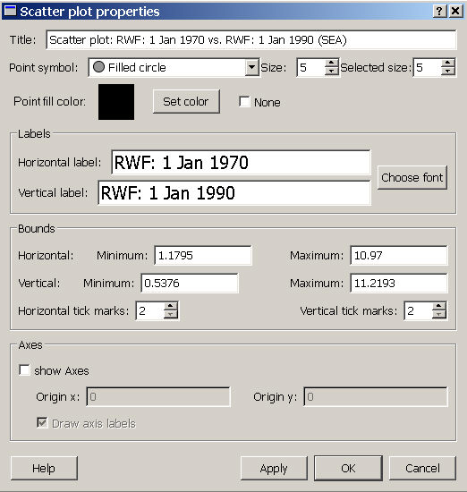
Title
You can change the title of the scatter plot at the top of the dialog box.
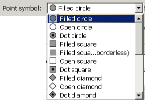
Point attributes
You can choose the symbol for points using the pull-down menu (see image below), and can change the point size, including the size that points appear when you have selected them ("Selected size" , on the far right). You can also choose the color for the point fill, or choose to no fill (check the "None" box).
Labels
You can alter the text on the scatter plot axis labels by changing the wording or the font.
Bounds
You can specify the range of values displayed on the scatter plot (minimum and maximum values shown on the horizontal and vertical bounds) and the number of labelled tick marks. Note that the default bounds are based on the range of values found in the dataset at the two specified times.
Axes
You can create a set of axes (or cross-hairs) within a plot at an origin of your choice. For example, the Moran Scatterplot is typically shown with an internal set of axes with x and y origins both set at 0. If you choose to add these axes, you can also add labels that indicate their origins on the original x and y axis.