


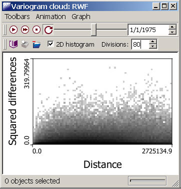
Variogram Cloud
 The variogram cloud (Haslett et al. 1991) is a plot of the average
dissimilarity between any two observations as a function of their separation
in geographical space. The variogram cloud can be used in exploratory
spatial data analysis to identify data pairs that differ more than what
is observed on average over the entire study area. If several "outlying”
data pairs involve the same observation, this indicates that this observation
is substantially different from the neighboring ones, and may be a spatial
outlier. You can make a variogram cloud of any of the data in your project,
as long as these data are in a point geography. For polygonal data
(i.e., counties) a centroid
geography must be created first.
The variogram cloud (Haslett et al. 1991) is a plot of the average
dissimilarity between any two observations as a function of their separation
in geographical space. The variogram cloud can be used in exploratory
spatial data analysis to identify data pairs that differ more than what
is observed on average over the entire study area. If several "outlying”
data pairs involve the same observation, this indicates that this observation
is substantially different from the neighboring ones, and may be a spatial
outlier. You can make a variogram cloud of any of the data in your project,
as long as these data are in a point geography. For polygonal data
(i.e., counties) a centroid
geography must be created first.
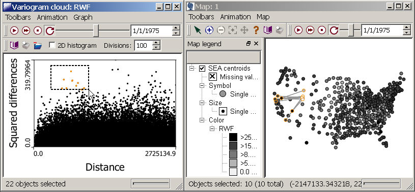
Like most views in SpaceStat, the variogram cloud can be animated; use the animation toolbar to scroll through the temporal range of your data. If you can't see the animation toolbar within the variogram cloud window, it can be restored by checking the "Animation" option under the Toolbar menu. As with other graphs and tables, values on the graph can be highlighted, and highlighted locations will be linked with the same data as they appear in other open data exploration views. You can also synchronize the animation in a variogram cloud with that in another view.
Identifying outliers with a variogram cloud
The most useful way to use the variogram cloud for identifying outliers is to link it with a map view (remember to select a map with the same geography; below we show the centroids for state economic units, or SEAs). When you have both the variogram cloud output (see creating a variogram cloud) and the map on your desktop, go into "Graph" and then "Properties" in the Variogram cloud window. Then select the "connect point pairs in linked maps" option near the bottom of the Variogram cloud properties window. With this option selected, you can highlight areas that "stand out" in the cloud because they are relatively close together but have very different values (see box of selected points in the variogram cloud, below). In this case, the selected points highlight a set of low values (white points) for this dataset (lung cancer rate in white females) in Utah that are particularly low when compared to some sites with much higher cancer rates (dark gray and black points) in nearby states.
Variogram cloud calculation
The dissimilarity between the values of the variable z measured at locations ua and ub is computed as half the squared difference between these values, [z(ua)-(ub)]2/2. One might expect this dissimilarity to increase as the separation distance, h, increases, since nearby locations often have similar values (e.g., show spatial autocorrelation). Using the notation presented above, the distance between any pair of points is expressed as h ab= |u a - u b|. When variogram clouds are created for areal data such as counties, the distance between any two areas (polygons) is estimated as the Euclidean distance between the corresponding geographic centroids. The variogram cloud can also be used to evaluate spatial dependencies in different directions, i.e., to explore anisotropy (Chiles and Delfiner 1999).
See "Create a variogram cloud" for a list of steps for creating a variogram cloud, including information on allocating pairs of spatial data into different groups for examination of anisotropy.
Large data set limitations
For very large datasets, the calculations become exceedingly slow; for this reason, creation of variogram clouds is currently limited to geographies with fewer than 5000 points.