Scatter Plot
Scatter plots allow you to visualize the variation in one variable relative to the variation in a second variable. In SpaceStat, you can make two kinds of scatter plots: plots of any two datasets in the same geography (over multiple times), or plots comparing values in the same dataset from two different times. When you make a scatter plot, your output will consist of the set of locations from your focal geography plotted on an x and y axis based on their values for the two datasets or two times for the same dataset. A Local Moran analysis produces a related figure, a Moran scatter plot.
Like most views in SpaceStat, scatter plots for two datasets can be animated; use the animation toolbar to scroll through the temporal range of your data. You can also synchronize the animation in two dataset scatter plots with animation in other views, such as maps. Both types of scatter plot views are by default linked to other visualization tools, so that areas selected in one plot, map, or table, are also selected in other visible views. For example, you may wish to select locations where values of both datasets are particularly high, and see where those values occur on the map.
|
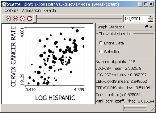
Scatter plot for two datasets over a range of times, with graph statistics window shown (right side). |
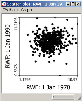
Two times (or "timeless") scatter plot with graph statistic window hidden (this also hides the regression line). |
|
|
|

Graph statistics for scatter plots
In addition to the plot, the scatter plot view includes a Graph Statistics
window that shows the mean and standard deviation of each data set at
the time shown in the animation
toolbar when you compare two datasets, or for the one focal dataset
at the two plotted times. This window also shows two coefficients
that measure the correlation between variables, the simple correlation
coefficient, and Spearman's rank correlation coefficient. The correlation coefficient page
describes these measures in more detail. By default, the statistics
shown in this window are for all of the points in the scatter plot, but
you can select a subset of points with the cursor, and then choose to
show statistics calculated for this subset -- under "Show statistics
for:", click on the open circle next to "Selection." You
can hide  or undock
 the Graph Statistics window using the
buttons in the upper right corner of the window, and can bring back the
window after hiding it by clicking on "Graph Statistics" in
the Graph pull-down menu.
the Graph Statistics window using the
buttons in the upper right corner of the window, and can bring back the
window after hiding it by clicking on "Graph Statistics" in
the Graph pull-down menu.
The regression line
When you activate the Graph statistics window, you will also activate the regression line within the plot. This simple linear regression line (also called the least squares regression line) represents the "best fit" line through your data, and is useful as a description of the relationship between two datasets, or for predicting values if you have a dataset that can be thought of as "dependent" on another dataset (an independent set, plotted on the x-axis). If you choose to show statistics for a selection, rather than the whole dataset, a second regression line will appear in orange. One way to use the selection option is to compare the original line to the one for the subset of data -- this will allow you to examine the influence of a few points on the relationship between to datasets. An example of this, as well as details on calculating the regression line, are presented on the regression line page.
The animation and graph toolbars
The far left pull-down menu in the scatter plot window allows you to hide or show the Animation (shown by default) and Graph (hidden by default) toolbars. Note that if you wish to change the time step size for animations, this option is available from the Animation pull-down menu, but not from the toolbar.
From the Graph pull-down menu or toolbar, or from the right click menu, you have the following options:
-
 You can alter the look of your scatter plot
by changing its properties.
Options here range from changes to the title and way things
are selected, to changes in the fill, size, and symbols used for points.
For two dataset plots, you can use options within scatter plot
properties to show variation in a covariate data set. For example,
the plot image below illustrates the correlation between the
log of the proportion of hispanic females in western US counties and
rates of cervical cancer, with the log of proportion of population
living below the poverty line included as a covariate determining
the size of
the plotted points.
You can alter the look of your scatter plot
by changing its properties.
Options here range from changes to the title and way things
are selected, to changes in the fill, size, and symbols used for points.
For two dataset plots, you can use options within scatter plot
properties to show variation in a covariate data set. For example,
the plot image below illustrates the correlation between the
log of the proportion of hispanic females in western US counties and
rates of cervical cancer, with the log of proportion of population
living below the poverty line included as a covariate determining
the size of
the plotted points. -
 You can print
your scatter plot.
You can print
your scatter plot. -
 You can export
an animated "two dataset" scatter plot as an .avi file.
You can export
an animated "two dataset" scatter plot as an .avi file. -
You can copy
a scatterplot to the clipboard as an image file, and then paste
it into other software program files.