
There are 2 categories of data utilized in geographic information systems: Vector Data and Raster Data. This distinction goes back to the founding days of GIS technology, when there were two major types of geographic information systems, one worked with raster data and the other with vector data. In those days, raster data referred to regular grids containing data, and Vector data to irregular geographic objects such as points, lines, and polygons.
That distinction still holds today, but many GIS can handle both vector and raster data simultaneously. Let’s explore the 2 types of gis data in more detail.
Vector Data
Vector data refers to data that is constructed from point locations — the { x, y } — and that are connected by edges to form lines and polygons. Once time is introduced, each of these objects (points, lines, and polygons) can change location through time. Point clouds can then move through time, and lines and polygons can change their shapes and locations.
If these objects have attributes associated with them, then the attribute values can change through time as well. There are four key types of vector data: points, lines, polygons, and location histories.
Points
Point data can be written as {a1, x1, y1, t1}. This representation is highly flexible—points have attributes whose values can change, as well as their geographic locations. One example is case-control data, where the objects are the study subjects. It then becomes possible to apply statistical techniques to assess the clustering of the cases relative to the controls. If clustering is found, it might indicate an infectious process. If clustering is found in chronic diseases such as cancer, it might reflect the action of geographically localized exposure – an environmental carcinogen. 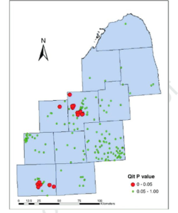
Case clustering of bladder cancer in 33 year old’s in and near Flint (upper center) and Jackson, Michigan (lower left). Red circles indicate clusters significant at the 0.05 level. A plausible explanation is an occupational exposure in those of working age.
Lines
Lines are constructed by joining together points using line segments, sometimes referred to as edges. A common use for lines is to represent road networks, rivers, powerlines, sewer lines, and pipelines. Attributes may be associated with each edge to indicate, for example, the road classification (e.g. divided highway, secondary road, rural road etc.).
Through time, the attributes might change, such as when a rural road is paved and becomes a secondary road. Or the network itself may change like when a new subdivision and its access and interior roads are built.
Polygons
Polygons are constructed from lines that close upon themselves, creating an interior and an exterior of the polygon. These objects are formally known as Jordan curves. At first glance it may be difficult to think of polygons in the real world that have changing attributes and shapes through time, so let’s consider a couple of examples.
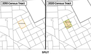
Census boundaries are often reconstituted as they are drawn by the US Census Bureau to certain requirements, such as pre-defined population sizes. Census tracts may merge or split, as shown in the figure illustrating the split of a Detroit 2010 census tract into two new tracts in 2020. In addition, the census tract demographic characteristics change from one census to another, and this would be represented by the polygon’s time-dependent attributes. Many GIS cannot handle time-dependent polygon shapes and attributes, although BioMedware’s SpaceStat and Vesta do. This allows more accurate space-time modeling and prediction, since the spatial support that is the foundation of space-time modeling is correct in SpaceStat and Vesta.
Municipal water supply district boundaries can change dramatically over time, and the associated water quality measures are also time-dependent. One example is arsenic in drinking water supplies in 11 counties in southeastern Michigan, as described in a study led by Dr. Jamie Meliker. Here, the problem was to reconstruct arsenic exposure over the life course, to better understand the relationships between bladder cancer and arsenic exposure. In Michigan, arsenic is a naturally occurring carcinogen that is found in certain geologic formations and can thus find its way into water supplies, both from private wells but also in municipal water supplies. Through time, water distribution districts often expand in geographic extent, and their sources can include both surfaces and waters. Dr. Meliker and colleagues tracked the residential histories of study participants over several decades, allowing them to reconstruct arsenic exposure from drinking water over that period.
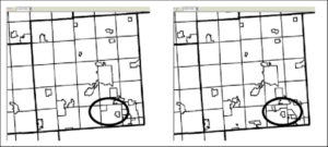
Town and municipal water supply boundaries change with time, 1950 (left) and 1992 (right).
Location Histories
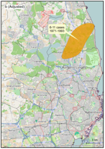
Location histories arise when objects move through time, these may be people, wolves, salmon, industries, and automobiles, to name a few. When you consider the residential histories of people, you may be able to reconstruct a person’s place-based exposures over at least some portion of their life course. Consider a study of breast cancer in Denmark, conducted by Dr. Baastrup and colleagues.
Here, 33 years of residential histories of 3,138 cases and two control groups of 3,138 women each were included. Statistical analyses identified a persistent cluster of breast cancer in the northern suburbs of Copenhagen, even after adjustment for known risk factors (such as smoking, refer to figure). This illustrates how residential histories may be used to identify clustering of cases over the life course.
Raster Data
Raster data are a regular array or grid of data values. Because they are arranged in regular rows and columns, the geographic location of a given pixel (a cell in the array), is known implicitly—we don’t have to record its latitude and longitude. Attribute values are recorded for each pixel.
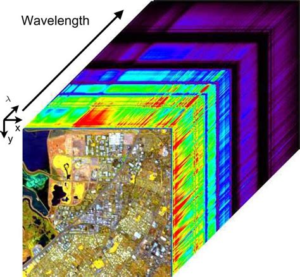
2 common types of raster include airborne and satellite imagery. For these types, the kind of sensor used dictates how many attributes are recorded. Sensor refers to the imaging device carried on the aircraft or satellite. Monochromatic sensors detect different shades of gray by assigning an integer to how dark a given pixel is. Hyperspectral sensors divide the range of reflected radiation (e.g., might be the visible spectrum) into discrete bands. For example, a 128-band hyperspectral system detects spectral coverage from 438 to 2507 nm. Here, nm means “nanometer” and is a measure of wavelength. This greatly improves the ability to identify substrates and features being imaged.
This image illustrates a hyperspectral data cube showing a geographic map of Moffet Field, California, with the hyperspectral bands (shown on the “Wavelength” axis) comprising the “slices” shown behind the geographic map. Source: P. Duhamel.
Rasters also arise in geostatistical analyses when the values of observations being modeled are imputed for locations where observations were not made. For example, Dr. Goovaerts and colleagues used a technique called kriging to model a raster surface of arsenic in groundwater in 11 counties in southeastern Michigan.
Data Fusion and Exposure Reconstruction
How can one deal with all of these different data types in a given project or analysis, especially when attribute values and locations may be changing through time? That involves something called “data fusion”, in which the different data types are analyzed simultaneously.
If you want to get into the nitty-gritty of data fusion through time, one important example is the assessment of human exposure to environmental contaminants. But for now, let’s take a high-level view.
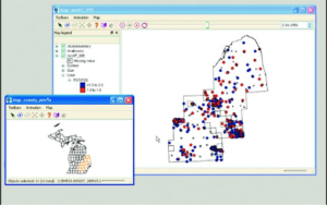
This gives us a better understanding of what went into the study of arsenic and bladder cancer in southeastern Michigan. Residential histories of bladder cancer cases and controls were collected for 11 counties in southeastern Michigan. Because people move throughout their lives, the spatial pattern of places of residence depends on when you look. The figure shows the residential addresses of cases (red) and controls (blue) on February 16, 1956.
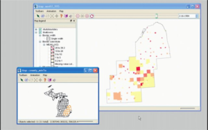
Another data layer comprised of time-dynamic polygons was used to represent the arsenic concentrations in municipal water supplies through time. The figure shows the municipal water supply districts as polygons with colors ranging from red (high arsenic concentration) to pale yellow (low arsenic concentration). The map changes through time, since both the geographic extent of the municipal water districts is time-dependent, as is the arsenic concentration. Here we see the municipal water supply districts on February 16, 1964.
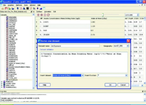
Knowing where people were living through time and the source of water supply and arsenic concentrations in those supplies, it becomes possible to reconstruct the life-course exposure to arsenic of the cases and controls over the duration of the study. We refer to this operation as a space-time join, which is easily undertaken in SpaceStat using one command, as shown in the figure, below.
Breaking down the complexities of GIS Data
You’ve embarked on a whirlwind tour of major data types and how they may be visualized and fused to undertake time-dependent exposure reconstruction. Other applications can build on and exploit spatially and temporally dynamic data models, but understanding the different types of GIS data is crucial for success.