Temporal trends are central in many fields—from epidemiology, economics, policy to environmental science. Being able to track how a variable changes over time, and link that change back to space or other covariates, is powerful. In BioMedware’s Vesta software, time plots offer just such a capability. They help make dynamic, space‐time data more intelligible. This post walks through what time plots are in Vesta, why they matter, how to make them, and best practices when tracking how a variable changes over time.
What Are Time Plots?
A time plot in Vesta is a visualization that shows how some variable (or variables) change over time. Key features:
- It allows users to explore data across multiple “time slices” (years, months, whatever temporal resolution your data uses).
- The plot is linked to spatial visualizations (maps) and other graph types (box plots, histograms, scatterplots), enabling “brushing & linking.” So selecting features on the time plot can highlight corresponding observations on a map, histogram or any other statistical graphic.
- Temporal dynamics are thus surfaced: trends (increase, decrease, peaks, troughs), fluctuations, whether variability changes over time, etc.
Why Are Time Plots Important? Understanding The Role of Visualization in Geospatial Analysis
Visualizing data over time is not just aesthetic—it’s essential for understanding patterns, generating hypotheses, and making decisions. Some key reasons:
- Detect trends and change points: Seeing temporal patterns (gradual trends, sharp changes, cyclicity) helps to find when important shifts occur.
- Space‐time interaction: When spatial and temporal data are linked, you can ask where changes happen when. For instance, has a disease rate increased in certain counties over time? Map + time plot + joinpoint regression can help with that.
- Hypothesis generation & exploratory analysis: Visualization enables spotting unexpected patterns—outliers, sudden jumps, seasonality—that merit further statistical investigation. Vesta supports this with time plots tied to other visualizations.
- Communication: Time plots are often more intuitive to stakeholders (public health officials, policy makers, the public) than raw tables of numbers. They tell a story.
How Do Time Plots Work in Vesta?
Here are the steps to create time plots in Vesta:
- Import your data: Make sure your dataset includes a time variable (dates, years, etc.). Missing times or missing values should be handled or flagged. Vesta supports missing data in import and handles it in visualizations.
- Go to Visualizations → Time Plot (or similar in newer versions).
- Select dataset and variable(s): Choose the variable you want to track over time. You may track more than one variable.
- Configure the time axis: Label the temporal resolution (year, month, etc.)
- Linking & brushing: Interact with the time plot by selecting (brushing) portions of it; the same observations (time slices, spatial units) will be highlighted in map, histogram, or scatter plot visualizations. This helps in seeing not just when changes happen but where.
- Saving/exporting: Once you have a time plot, you can export it (image, etc.) for reports. Be mindful to capture time‐dependent info correctly when exporting.
- Use alongside other methods: For example, joinpoint regression (for detecting change points), regression methods, etc., to add statistical rigor. Vesta’s later versions add joinpoint regression that can predict into the future.
Watch a full demo of using time plots in Vesta here.
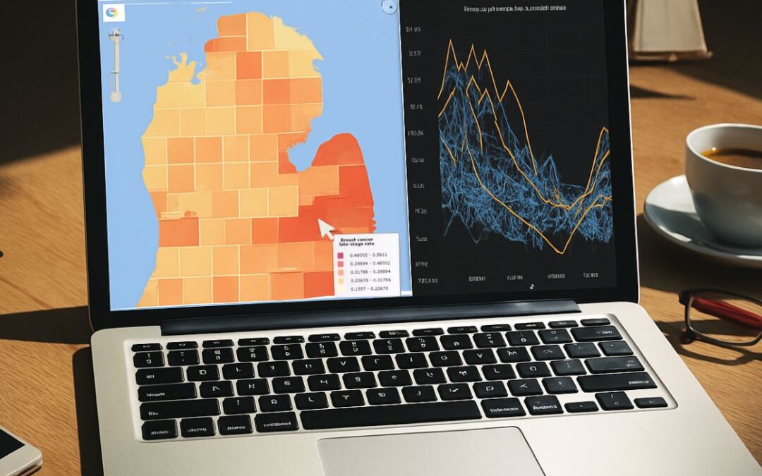
Case Study Using BioMedware sample data
To illustrate, consider the sample dataset “Michigan Cause of Death 1979‐2007” included in Vesta 2.8 and later Vesta versions.
- A time plot was made for mortality due to infectious diseases, cancer, cardiovascular disease, and respiratory illness across time.
- Notably, infectious disease mortality had a peak around 1991‐92. For Washtenaw County, the trend initially rose but then declined after medical advances (especially for HIV/AIDS). See this blog for more details.
- Joinpoint regression detected the peak (joinpoint), and forecast what might happen beyond the observed time range. The forecast predicted a decrease after the peak, matching historical developments.
This demonstrates how time plots + statistical modeling in Vesta can both describe the data and offer insight into future patterns.
Tips & Best Practices For Utilizing Time Plots In Vesta
When using time plots in Vesta, there are a few best practices to keep in mind:
- Quality of temporal data matters: Regular time intervals, minimal missing data, and accurate timestamps help. If data are sparse or irregular, be cautious when interpreting variability or trends.
- Handle missing values explicitly: Vesta marks missing data, but make sure you understand how gaps affect visualizations and models.
- Consider granularity: Sometimes aggregating (e.g., from monthly to yearly) smooths noise; sometimes fine temporal resolution gives more insight. Use the resolution that matches your question.
- Check for change points or anomalies: Sudden shifts might indicate data issues or real-world events; use joinpoint regression to investigate.
- Use linked views: Use brushing to view the time plot with maps, scatterplots, etc., so spatial heterogeneity is visible and to identify space-time patterns.
- Visual clarity: Label axes clearly, and choose color scales that are intuitive.
Where Time Plots Fit in the Broader Vesta Workflow
|
Rapid Visualization Relationships in the data are revealed through animation and User-computer interaction |
Hypothesis Generation User formulates hypotheses that explain observed data relationships |
Modeling Hypothesis-based advanced geostatistical models are created using Vesta’s expert advisor |
Testing Hypotheses are tested using the models and Vesta’s inferential statistics |
Knowledge Discovery Plausible explanations are identified, supporting policy formulation & interventions |
Time plots are one component of Vesta’s suite of space‐time tools. Others include:
- Map visualizations (static and animated)
- Box plots, histograms, scatterplots, heatmaps
- Variograms, kriging (spatial interpolation, change of support)
- Space-time analytics, including regression, joinpoint regression, machine learning and others
In practice, a workflow might look like:
- Import data
- Explore via mapping to spot spatial patterns
- Use time plot to see temporal behavior
- Apply statistical methods (regression, joinpoint) to test and predict trends
- Return to visualizations (map & time plot) to validate findings and communicate them
There are some limitations and considerations, however, including:
- Time plots show trends but may mask underlying variability or outliers unless linked views and brushing are used.
- Forecasting is always uncertain—past behavior does not guarantee future. Models (joinpoint or ML) need assumptions.
- If observations per spatial unit are few, temporal noise may dominate.
- Temporal resolution mismatches: If spatial units have different times of measurement or missing time points, care must be taken in alignment.
Try Out Vesta For Your Next Geospatial Data Project
Time plots in Vesta are a powerful tool for exploring, communicating, and modeling temporal dynamics in geospatial data. With the ability to link time plots to spatial and statistical views, Vesta helps you see not just what is changing, but where and when. Combined with methods like joinpoint regression, they allow for insightful exploration and robust inference.