Introduction to Visualizations in Vesta
Creating and exploring maps and charts in Vesta is probably what brought you to Vesta in the first place! The following sections will go through each available visualization option and how to create it. Once created, you can conduct a multivariate exploratory data analysis, and identify major spatial and temporal features of your data.
Any visualizations created from a dataset will display in the workspace area. Multiple workspace tabs can be created and visualizations can be created and displayed in different tabs as needed. Also, visualizations from different datasets can be displayed in the same workspace tab.
All visualizations can be customized by clicking on the upper right hand setting icon, which opens a live settings panel for that panel type — every edit applies immediately, and a Reset all control returns every field to how it was found. Maps use their own dedicated Map Settings panel; see Creating a Map.
To learn about visualization animation, see Linking and Brushing.
The Visualize Hub
Visualizations are created from the Visualize hub in the main rail (see Navigating Vesta). It offers two ways to build a workspace.
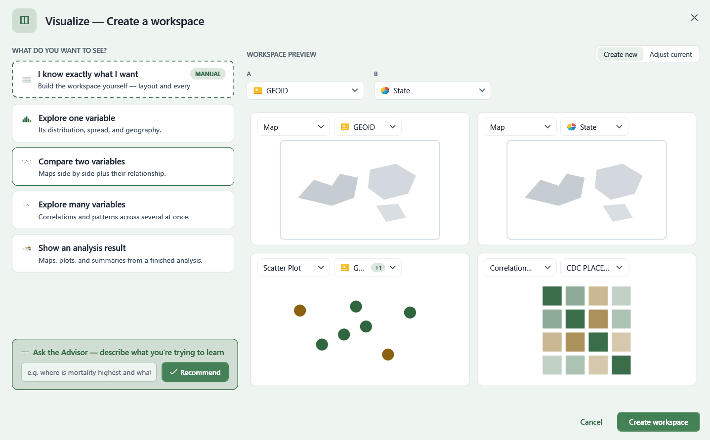
Guided: "What do you want to see?"
- Explore one variable — its distribution, spread, and geography.
- Compare two variables — maps side by side plus their relationship.
- Explore many variables — correlations and patterns across several at once.
- Show an analysis result — maps, plots, and summaries from a finished analysis.
Not sure what fits? Describe what you're trying to learn in the "Ask the Advisor" box and select Recommend — Vesta suggests a visualization based on the shape of your data.
Each option shows a live workspace preview before you commit, with a chart-type and variable picker on each pane — both adjustable, and each variable dropdown is searchable.
Manual: "I know exactly what I want"
Build a workspace yourself: choose a preset layout (1-var, 2-var, 3-var, or Blank) or a manual grid, then fill each pane by adding a view from the catalog:
- Maps — Map
- Charts — Histogram, Cumulative Distribution, Box Plot, Scatter Plot, Heatmap, 3D Scatter Plot, Correlation Matrix, Time Plot
- Tables — Table
- Results — Result Map, Contingency Table, Result Plot, ROC Curve, Analysis Summary
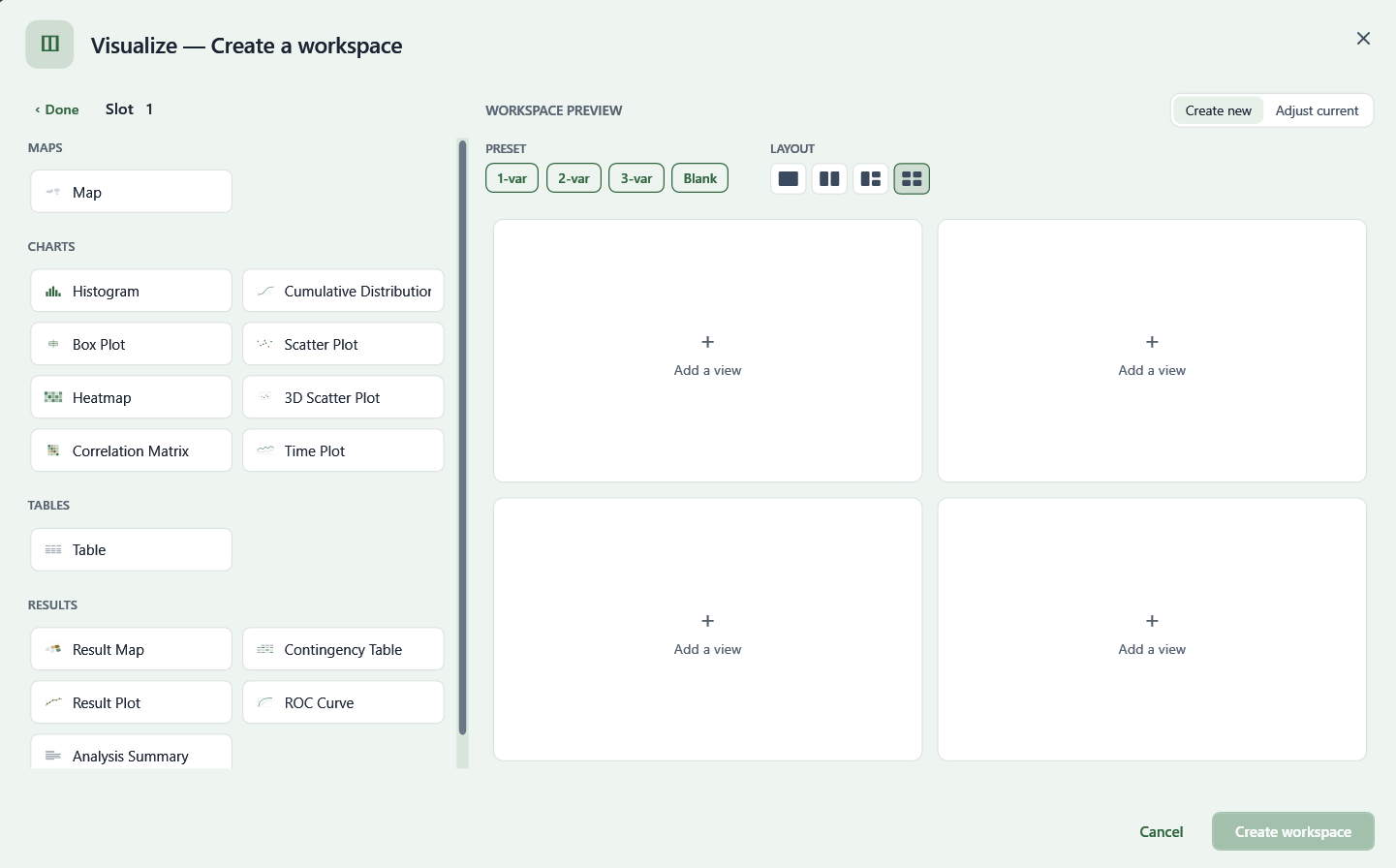
Either path can create a new workspace or adjust the one currently open, using the Create new / Adjust current toggle.